Wednesday, January 30, 2008

Lost in Love; Love Lost; Lost Love

You are certain of your own personal morals and principles that you set for yourself in life,

But somehow, you are still missing something very important:

You have not found another soul, that other recognizable soul to share your wonderful life with,

And to get the same share from.

One day, one very fine day, you found love.

Love is innocent;

And it grows, day by day, slowly but surely.

Love makes all things seem clearer than ever,

Because love liberates everything,

And so, slowly but surely, you learn to fly.

Unstable, it is; full of ups and downs, yet sometimes steady too;

Then again, it’s life.

But another day comes when you fly long enough that you don’t know how to land again when you need to do so.

You lost your pace, you grew more unstable,

Inconsistency, uncertainty, and therefore weak.

And thus you are lost.

You don’t know what is wrong, you don’t know when it all started, you don’t know where to go, you don’t know who’s to blame, and all that happened without you yourself knowing why.

However…

As long as you feel that love is there, real love is still there,

It will find a way.

Love will definitely find a way.

So find your way back into love,

And life.

Because it will find you back.

Because you know you have recognized another soul just like yours before.

Because in your heart you KNOW.

Therefore, a day will come when the way is clear,

Thus may God’s will be done.


A writing inspired by Hugh Grant's and Haley Bennett's "Way Back Into Love" and also by life's experiences. Here's the lyrics of "Way Back Into Love", to get a better idea of what I am trying to say in my writing.


I've been living with a shadow overhead
I've been sleeping with a cloud above my bed
I've been lonely for so long
Trapped in the past
I just can't seem to move on

I've been hiding all my hopes and dreams away
Just in case I ever need them again someday
I've been setting aside time
To clear a little space in the corners of my mind

All I want to do is find a way back into love
I can't make it true without a way back into love

I've been watching but the stars refuse to shine
I've been searching but i just don't see the signs
I know that it's out there
There's got to be something for my soul somewhere

I've been looking for someone to shed some light
Not somebody just to get me through the night
I could use some direction
And I'm open to your suggestions

All I want to do is find a way back into love
I can't make it through without a way back into love
And if I open my heart again
I guess I'm hoping you'll be there for me in the end

There are moments when I don't know if it's real
Or if anybody feels the way I feel
I need inspiration
Not just another negotiation

All I want to do is find a way back into love
I can't make it through without a way back into love
And if I open my heart to you
I'm hoping you'll show me what to do
And if you help me to start again
You know that I'll be there for you in the end

Tuesday, January 29, 2008

Figure Drawings: Movement & Gesture


2 minutes for each pose. We were told to concentrate on the direction of the shoulders, the direction of the mid-line, and the direction of the pelvis.


5 minutes for this drawing. Again, the direction of the shoulders, the direction of the mid-line, and the direction of the pelvis.


60 minutes for this drawing. This is the first drawing I have done in the Figure Drawing class I am taking at the Academy of Art University. We were told to keep this drawing until the end of the semester to see our improvements during the semester. This drawing is also done because our instructor wanted to see how good or how bad we were before learning any drawing skills to draw a professional figure drawing.

Monday, January 21, 2008

CBD Pluit


A glass wishing tree. Object located inside an interior designer's room who lives in CBD Pluit.

Tuesday, January 15, 2008

Funny Expression


This is my last project from my Analysis of Form class at Academy of Art University. Well, the project is supposed to be a portrait, showing the whole part of a human face and focusing only on the human face. So obviously we can't fake proportions on a human face, and of course, our choice of picture reference should have clear representations of form shadows, cast shadows, reflected lights, and full range of value, because those are the things that defines a form. After all, it's an Analysis of Form class. This is the only drawing that I have done in the class that I am 100% satisfied with, that's why I got an A :) The proportions of the facial features in my drawing looks very much like the picture reference, and the values are all correct too. I didn't define too much of the details in this drawing like in the previous drawings, that's why this drawing looks the most realistic one of all. Focusing too much on every detail will not only make you frustrated but also will make your drawing look more unrealistic with your super detailed values and overly concentrated details that in real life, people don't really notice if viewed from afar.
By far this is the work that I'm proudest of, and so I took 3 photographs of it:D I also framed it and put it on my bedroom wall too, along with my 'Working Desk' self-portrait.


Working Desk


This is the final project of my Basic Drawing class at Purdue University. It's a self-portrait, but it's not about just drawing our own big fat face, it's about making a drawing that tells a lot about ourselves, so it can be in any form we want. I basically got a whole lot of ideas, but my friends and my instructor loved this idea the most, so OK I did this, in just 2 days' time, including 1 sleepless night.


So the idea is that, in the picture, I was drawing myself on the big white paper that was spreaded across the desk. That part of me was the only drawing of myself in the picture that emphasizes the beauty of lines, well, and also the part of me in 'My Family' photo. But the one in the photo is the type of drawing that I do when I was 9 years old (the year '1999' was written above), and the part of me that I was drawing was when I was 17 years old (the year '2007'). Then beside the photo is a crumpled piece of paper, just to show that there is not a single great artist whose desk is tidy ^^

Then there's a "Fly Away" picture of a butterfly flying away... I like butterflies, and I make quite a lot of works with butterflies, so it has became a part of me and that's why it's in this picture. Then there's a failed math test, which apparently was supposed to be a simple one. Now why are there so many number 9s in it? Just showing that 9 is in fact my lucky number, and I suck at math and I hate it, so I drew a lot of craps on the paper. And then there's another part of me with my face beside a sunflower. Well, sunflower is my favorite flower, and even though my face is not as bright as a sunflower, I try to make it that way in the picture :P

And then there's a painting called "Freedom", simplicity is what counts. Blue is my favorite color, and freedom is what I am if I'm a word, so the purpose of the picture was to show those facts. And there's another part of me with the composition only showing my legs, and dolphin, at a beach, in the morning. I prefer sunrise over sunset, and I love dolphins (at that time I haven't begun my obssession with dogs, but I always love dolphins and their carefreeness and freedom, and most of all, their smile!) and then why my legs? Because my star sign is Pisces, my legs are considerably the most dominant part of my whole body.

Then there's another part of me in a more solid and graphic kind of drawing. My expression is very emotional in that picture. Just shows that I'm a very emotional person. "A woman's heart is an ocean-deep of secrets" describes a lot about me, so I put it in the picture too, and for your information, the quote was taken and paraphrased from the movie Titanic. Below the quote is a torn picture of the depth of an ocean with a treasure box. Inside that treasure box lies my heart :P This was inspired by Pirates of Carribean: Dead Men's Chest.

So there's also my pencil stand, a bright pink one with a strawberry on it. Why strawberry? Because a special someone in my life refers me as a strawberry, and when you refer someone as a strawberry, it means you like them :) And why all the blue colored pencils? I mentioned it before, because I LOVE blue. Why a sunflower? Because I love sunflowers. Why a long, metal ruler? Because every artist needs a long, metal ruler.

So the brush, the cutter, and the mechanical pencil was there just to show that you I am in fact an artist. And so I really showed a lot of my ego in this entry, huh? But the truth is, I am not that satisfied with this picture, because the poor quality of my craftsmanship, and basically just the messy composition. But oh well, it describes me a lot, that's why I framed it and put it on my bedroom wall.

Monday, January 14, 2008

The End of Pottermania

"All is well."
She sighs :)
She closes her eyes.
She falls asleep on the futon.
She first snores, and then she falls down from the futon. So does the Dark Lord.
She wakes up.
She opens her eyes.
She sighs :)
All is well.


I am not really sure whether this is a form of haiku, but what's for sure is that it's a poem. I try to express this impression of the excellent ending of the last book of the Harry Potter series. It is so good that this reader ("she") smiled to to herself ( " :) " ) and fell into a good sleep so immediately, and so she began to enter the happy world of Harry Potter in her dream, joining Harry Potter and his friends. Just the moment she entered the world, she fell down from the couch and banged her head so hard that she woke up. But when she realized that nothing is wrong, she sighed with relief again and realized that everything is fine.

You do realize that there are 9 lines, right? The first and the last lines are the same, the second and the eighth are the same, the third and the seventh have opposite meanings, the fourth and the sixth have opposite meanings, and the fifth line alone is the longest line and so it happens that the fifth line has no pair out of the 9, unlike the other lines that I paired. But everything is in present tense. Just so to say that all is well right now, right at this moment, so the past and the future is not considered at all, because we are celebrating the moment of now, the present.

Now that I've explained it through, I do think it is a haiku.


haiku [(heye-kooh)]

A form of Japanese poetry. A haiku expresses a single feeling or impression and contains three unrhymed lines of five, seven, and five syllables, respectively.


"haiku." The American Heritage® New Dictionary of Cultural Literacy, Third Edition. Houghton Mifflin Company, 2005. 14 Jan. 2008. http://dictionary.reference.com/browse/haiku>.

Sunday, January 6, 2008

Pucca Funny Love Story


Pucca Says Hi


She's saying Hello, but inside she knows it's goodbye.

East Wind Breaks the Plum Blossom

Pine Tree in Shanghai 1943

Black Swan on a Fine Day

Study: Form Shadow, Cast Shadow, Reflected Light

Crop

Find Stacia

Stacia's Butterfly

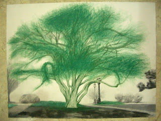
The Wishing Tree

Lost

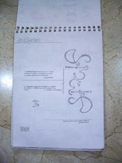
Ambigram


Did this around 2 years ago, so that means 2006. Inspired by the novel Angels & Demons by Dan Brown.

Mew


ABSOLUTELY no tracing. Did this in 2004, when Pokemon was still in.

Panorama


This is actually a Perspectives project. I know, who would've guessed. Honestly, I still cannot get what is one-point, two-point, and three-point perspective after I finished my Basic Drawing class, even after I finished this project. But I got it now, which is a year later.
So, actually it was optional for us to draw with two papers. I just took the advantage to experiment more, as usual :) For the record, it was also optional to use recycled paper, and so I used it, so that I could purposely put those super bright white highlights on the handrests and the lights above. I love the whole image, because the values are correct, and the space and depth are correct, and also the proportions are all in order. The only problem is, it doesn't look like a Perspectives drawing.

Negative/Positive


Yes, one of my Basic Drawing projects when I was still at Purdue University. Apparently, this is a practice of seeing negative shapes instead of the positive ones. So this is pretty hard and takes FOREVER, because when we were drawing, we were told to see and draw the shapes of the negative shapes instead of drawing the positive shapes and then erasing the outlines. So you can so easily get improportionate shapes. But I love my color composition in this picture. Clearly I used complementary combination to show contrast.

Crane


This is another Value Study project. The difference is just that this involves planes, therefore it's easier to tell the differences of the values. Again, this is one of my Basic Drawing drawings that I have done when I was still at Purdue University. I love the correct values on the crane, but not on the background, and the proportion of the shadow is also not quite right.

Eggs


Obviously, this is a Value Study project. We were given white eggs, white cloth, and white onion, and it's a still life. Again, this is one of my Basic Drawing drawings that I have done when I was still attending Purdue University. I kind of like it, because the values are close to perfect. For those of you viewers, just ignore the cropped cloth on the right. Better yet those photoshoppers, if you bother enough to view my composition without any distraction, try to erase away the whole cropped composition. Thank you for your attention.

Sculpture Bust


I don't know how many times more do I have to say that this is one of my Basic Drawing drawings when I was still at Purdue University. I actually kind of like this picture, because of the depth that it shows. I love the idea of putting the scissors and the paper out of the border, and the value contrast is just amazing. However, the white background is improportionate, apparently. My border should also be even. Other than those, I like this picture.

Drapery


Trust me, my Academy of Art University Drapery project is far better than this one. Again, people, this is one of my Basic Drawing projects when I was still at Purdue University. Notice the bad, bad perspective in the ceiling? Yeah. And the values are all wrong. But at least I love how I showed transparencies and textures in this picture. The stools below looked so confusing, don't they? Because of the parts I purposely cropped just because I was getting tired of drawing at that time of the semester.

Trees


Again and again, this is one of my Basic Drawing drawings when I was still at Purdue University. This is the Landscapes project. It's just one of the sceneries at my campus. I can't even remember the name of the street that I was drawing at, but I remember that I got a really bad sunburn when I finished my work. Well, there was supposed to be a building at the background, but I ran out of time, plus I got sick during the week. Ironically, the sketches I made below are far more beautiful than the actual work above. The sketches below I made with several different media, such as chalk, white charcoal pencil, highlighter, marker, pen, et cetera. I was just trying to figure out which style of drawing trees best suits me.


Onion


Again and again, this is one of my Basic Drawing drawings when I was still attending Purdue University. This is the first ever classwork. I remember my instructor brought lots of fruits and veggies to class and she made us pick one by random. Ironically, I picked a hard one. You noticed the leaves? It didn't kill me though, I just draw whatever's there, without any second thoughts. Precisely. The Picasso way. So there it is, my line drawing. No sketchy lines, just beautiful and clear lines.

Untitled


Nobody would have guessed that this was supposed to be an Organizational Lines Practice. NOBODY. Right? Because, the space and depth of the objects look so confusing, the values are wrong all over the place, the sizes are not proportionate, and of course, there are absolutely no organizational lines in this picture. But, oh well, I still have no idea why I got an A. Therefore I upload this up for more critiques. Oh, and again, this is one of my Basic Drawing drawings when I was still attending Purdue University.

Paper bag: Crackers, Candies, Hersheys, Kisses.


I can only remember the feeling when I was doing this project. Again, this is one of my Basic Drawing projects when I was at Purdue University. I remember I felt really happy, really sweet, really romantic... You know, that mood you get after you have your first few sips of red wine. I remember that I was just doing it without caring at all what mistakes that I did, like what strokes should I not do, what direction of the pen should've I went, et cetera. And for the record, yes, I used a ballpoint pen for this project with watercolor pencils. So for those of you who are viewing this entry, will you please, please view the enlarge image? That way you can see my beautiful strokes that creates all those beautiful value :D Actually, it looked better when I haven't apply any color on it...


Shoes


This is one of my Basic Drawing class project when I was still attending Purdue University. This is the Object Study Project, where we have to make 3 different works that involves one object. I forgot the specifications for each of the 3 works, so I'll just go ahead and describe my works based on the criterias that I remember. So, I chose this shoe to be my object. Just for the record, this is one of the Guess shoes I bought, designed by Marciano of course.

Oh, and by the way, I didn't do the 3rd work, because I got tired (and honestly, I got quite lazy after so much COM 114 craps :p [COM 114: Fundamentals of Speech Communication class, which everyone hates])


So on the first work, I focused more on the negative shapes of the shoe. I also made lots of sketches first to get a good composition. Well, actually I like my work, at least, I like my idea, the only APPARENT thing that's wrong is the super, duper, uber dirty fingerprints and other miscellaneous dirts on the white spots that I somehow couldn't erase anymore. I used marker, color pencils, and charcoal pencil for the whole work. And you know what, when I look at the work again, I think that the big black shoe on the bottom left corner should be shifted more towards the left, well, shifting it justtttt a little. But hey, I can do better now, really, after looking at my past projects at Purdue... It seems that I've improved a lot; just by believing that I have the huge potential :)

As for the 2nd one, I didn't do a lot of sketches. I remember very clearly that I got the idea of the composition just like that. In an instant. And I do love the result. The only thing that's bothering me is the border color, I don't think it should be black, and for the black shoe, I don't think the shoe value should be as dark as its shadow's value. That's all that's wrong. I guess.